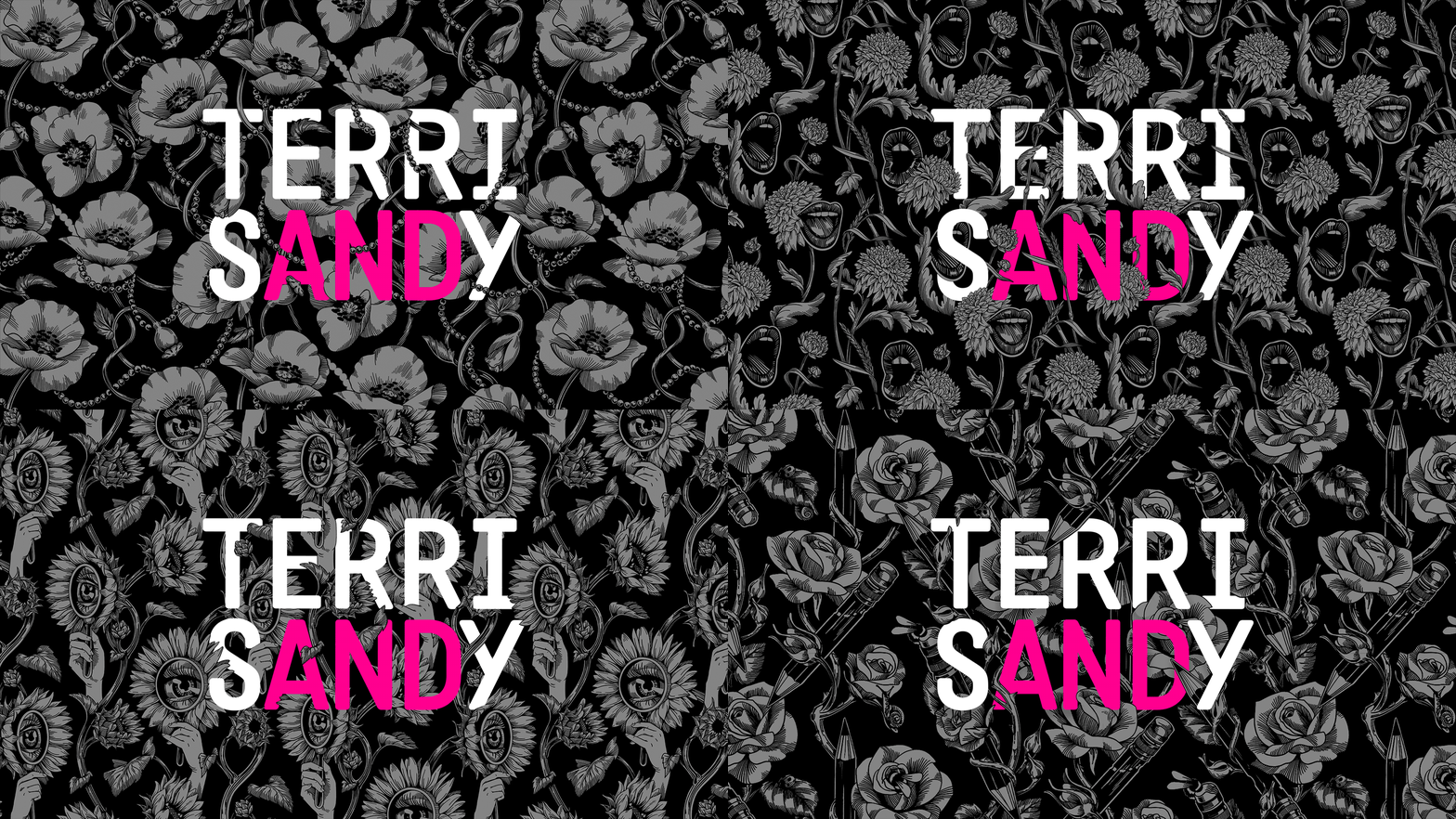
Fierce. Friendly. Fearless.
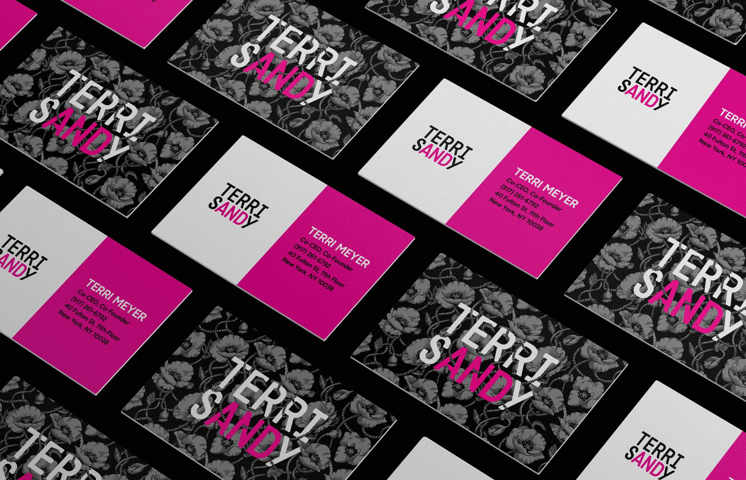
After seeing my rebrand work for GroupeConnect, Terri & Sandy asked me to help them with their own. Terri & Sandy have built one of the most successful and highly regarded women-run agencies in the industry—and after 13 years, it was time for a brand refresh.
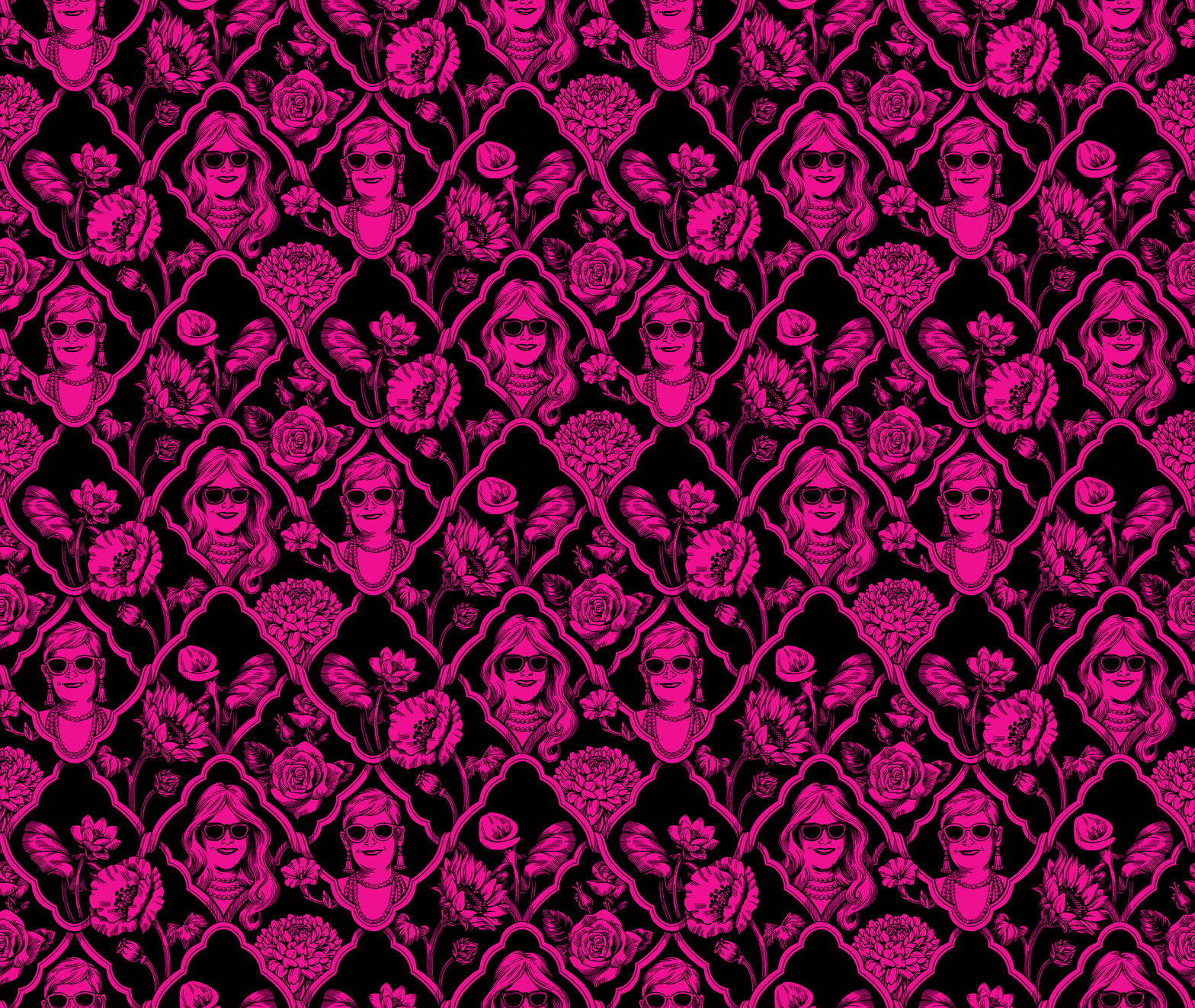
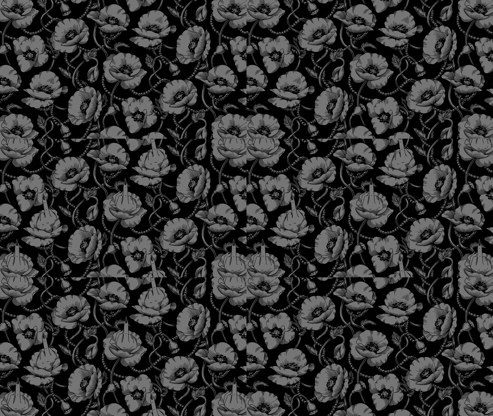
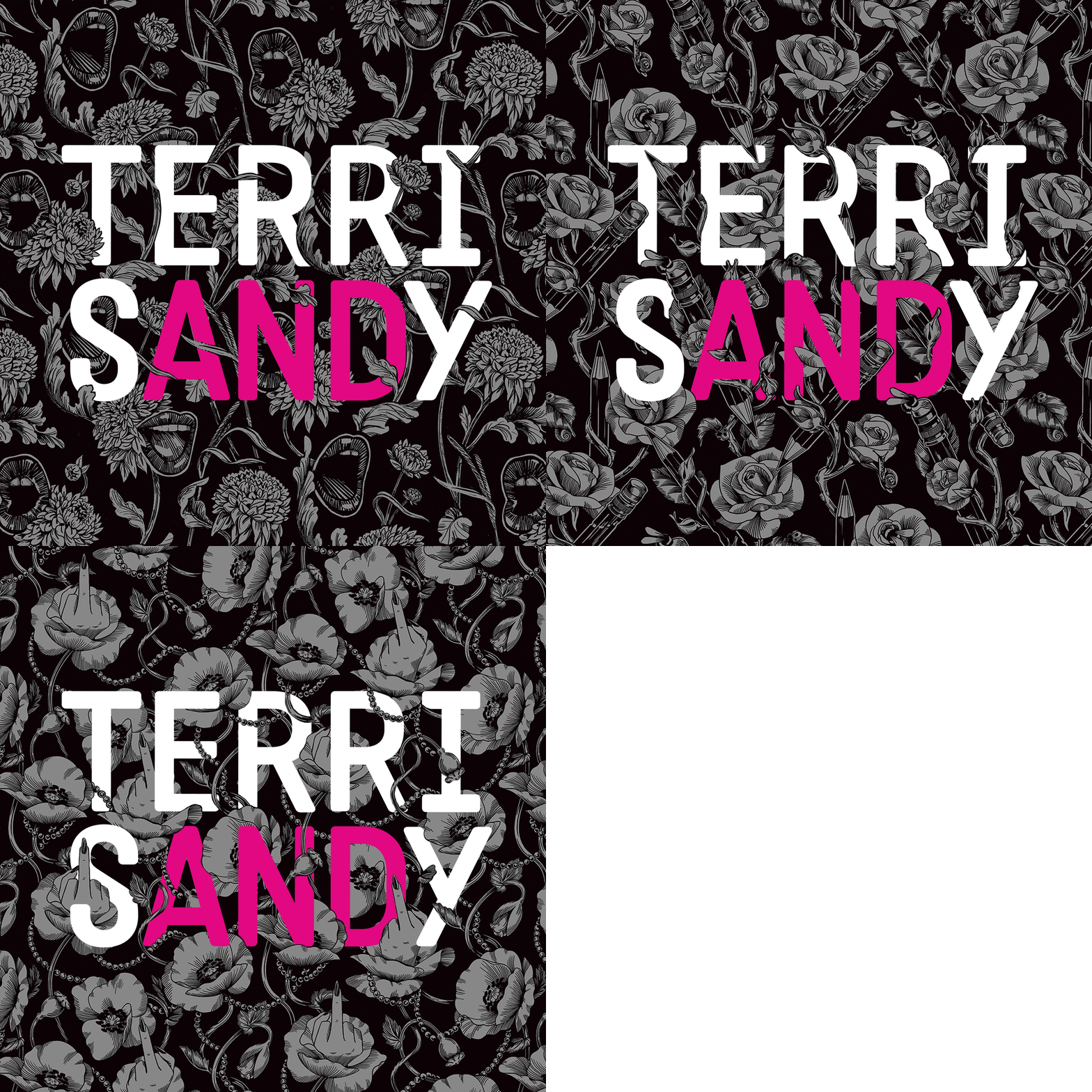
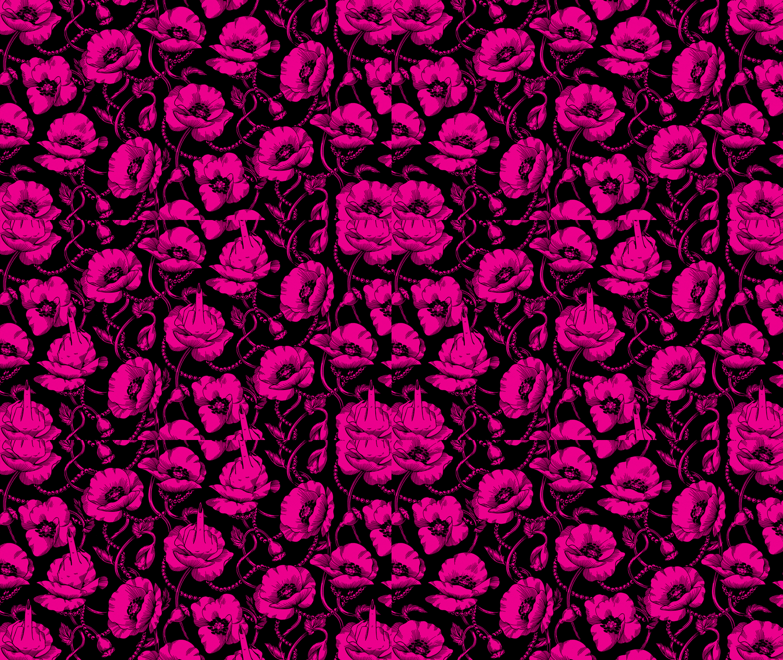
The backbone of the new identity are 8 beautifully intricate illustrated patterns that communicate the creative and powerful personality of the T&S brand. They capture the agency’s essence of being fierce, friendly, and fearless.
These one-of-a-kind patterns (created by an all-female creative team) combine bold, modern accents with timeless, lush floral illustrations bursting with intrigue. Every pattern embodies the perfect balance of quirkiness, edginess, and femininity—along with hidden Easter eggs that help tell the story of the agency.
Read more about it here: Little Black Book
Awards
Communication Arts Illustration // Shortlist // Self-Promotion
